Adobe is well-known for its fantastic products, like Adobe Photoshop, which are rich in features and premium as well. However, it has also gifted some free apps and other services to users, like Adobe Acrobat Reader DC, Adobe Voice, Adobe Sketch, and more.
In the list of those free products of Adobe, here is another valuable online application, known as Adobe Slate. This was earlier available for iPad only, but now you all can also use it on your desktop using any of your favorite web browsers.
Adobe Slate lets you create elegant presentations, visual stories, web pages, or any other project you are interested in. Whether you want to convey some message about your newly launched product or anything, Adobe Slate can be a good option to try. You can use text, photos, and links to complete your project and share it with people. If you want, your project can also be set to private, before publishing the project. There are total 11 themes and couple of handy formatting options to make your project look beautiful.
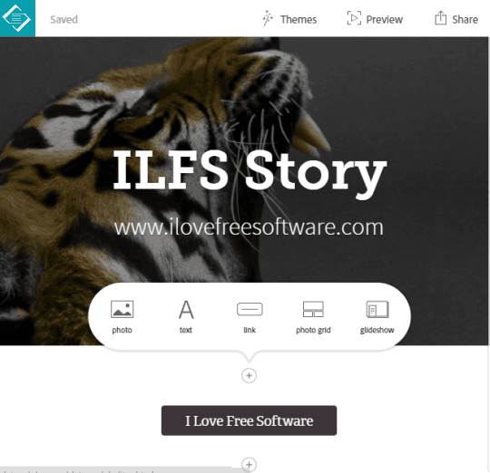
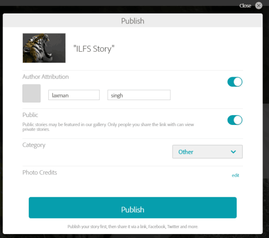
The screenshot above shows options and a sample project created by me using Adobe Slate.
The output looks really good and you can feel like a pro web designer, while using this application. You can share the project URL to your social media accounts, add it to your own website, or anywhere to promote your product using this website. Before you publish what you have created, you can also preview it. Moreover, a published project can also be cancelled by you anytime. So it has provided a lot of facilities to users.
Use Adobe Slate To Create Beautiful Visual Story, Presentation, or Web Pages:
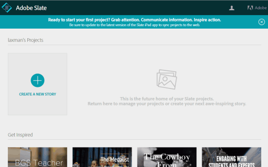
To use Adobe Slate, you must have your Adobe ID, which can be created for free. So go to the homepage of this application, create your Adobe ID (if not created already), and sign in.
Now you can create your very first story by using the CREATE……. button. If you want to get some inspiration first, then you can also see the public stories of other users.
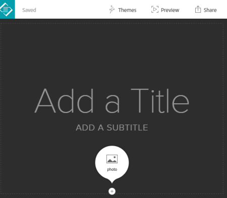
To create your project, you first need to add a title, a subtitle, and a background photo related to your project or product.
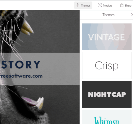
You can also change the default theme for your story. Clicking on Themes option opens a right sidebar that contains different themes. You can click on any theme to change the default them. Interesting part is that text font is changed automatically according to the selected theme.
After this, you can scroll down the webpage and click on ‘+‘ button to explore all the options that you can use to complete your story. Available options are:
- Photo: You have the choice to use multiple sources to insert a photo to your story. You can add a photo from your PC, Dropbox account, Creative Cloud, Lightroom, or search Creative Common Licensed photos to insert in your story

- Text: This options provides some basic formatting options. For example, you can select heading type (H1 or H2), set text alignment, add bullets
- Link
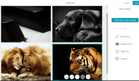
- Photo Grid: This is one of the important options using which you can bulk insert photos in a 2*2 size grid. You can also move an image or replace it and delete it. Before adding the photo grid, you can also preview it, and then save the changes
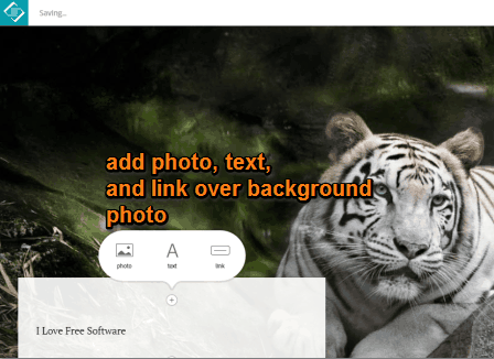
- Glideshow: This option is used to first insert multiple photos (as background) vertically and then insert photo, text, and link over those photos. See the screenshot below. You can also change the position of text box
When you have done everything, you can preview the output.
Finally, you can use Share option to publish your story. Before publishing the story, you can make it public or private, enable author attribution, and select a category.
Conclusion:
Using this application is really interesting and creating the stunning visual stories, presentations, or webpages is very simple. It’s good for regular users, but it could have been more valuable with few more options. There is a shortage of formatting options and themes are also limited. Overall, I must say it’s a good application to use for the purpose.
Check out Adobe Slate here.
