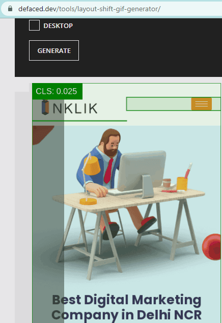
Layout Shift Generator is a free tool to visualize Core Web Vitals Cumulative Layout Shift as GIF. Here it comes as an online as well as command line tool that you can use to calculate the total commutative shift in your website design on mobile as well as desktop. It generates GIF output and animates the shift in the design. If it is higher than the expectation, then you can send this to the developer to fix the issue.
Cumulative Layout Shift is one of the parameters in Core Web Vitals. For it to be minimum is the requirement, otherwise there will be instabilities in your overall webpage design and your audience may not like that. Bad shift in the webpage layout gives bad experience to a user and thus it should be avoided at all cost.
If you wish to read more on Cumulative Layout Shift and this article explains it beautifully. Even if your website has a slightly higher CLS there is no tool to visualize it. But the tool I have mentioned here can help you do that in a few seconds. The best part is that you can run it online as well offline.

How to Visualize Core Web Vitals Cumulative Layout Shift as GIF?
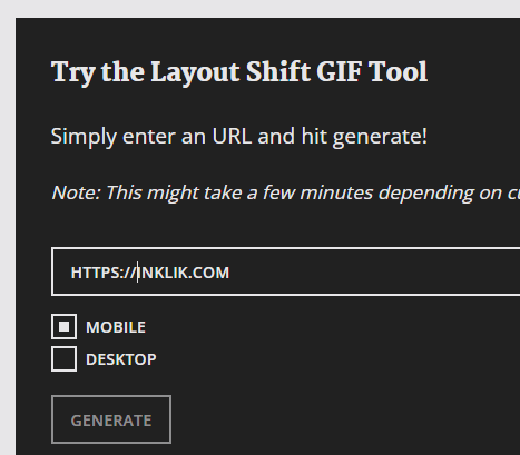
You can use this tool online and there is no sign up or registration is required for it. The main UI of the tool looks like as shown in the screenshot below.
Now, you just enter the URL of the website you want to test. Specify whether you want to test it on desktop or mobile. After that, you submit it and then let it analyze it for you. You just have to wait a bit for it to finish.

Once it is done, it will show you the generated GIF that you can save on your PC. Also, you can generate the GIF for both; desktop and mobile version of the website.

In this way, you can use this simple online tool to generate CLS shift in animated manner. The tool is free as well as open source. If you wish, then you can install it locally on your PC and do the same thing. You will need Node.js though, and the local version of the tool will be quite faster than its online counterpart.
Final thoughts:
If you are a web or frontend designer, then you will like this simple tool. You can quickly analyze the visual flaws in the web design and then take further steps to fix them. This is simple and you will like the way this tool works. An example of the animated output can be seen in the GIF I added in the beginning.