One of the easiest methods to explore and analyze a dataset is using charts. With the help of charts, one can easily show complex data which in an easy to consume form. In this article, I will cover a free online service that lets you create charts from Trello Board data.
Vizydrop is a business platform that provides an easy way to visualize Trello board data as interactive charts. With the help of this website, you can create various types of charts which are completely customizable. The free version allows you to have one chart at a time. However, you can export the chart as JSON, CSV, or PNG file, and delete it from the Vizydrop to create a new one.
Also read: How to Add Checkboxes to Trello List to Convert to Task List
How to Create Charts from Trello Board Data?
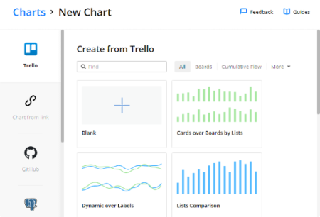
The process of creating charts from Trello boards is simple with Vizydrop. First, visit the Vizydrop website and log in with your Trello account. Once you do that, this app loads all your Trello boards and asks you to choose a chart type which you want to create.

With this website, you can create the following charts options for your Trello board data:
- Cards over Boards by Lists
- Dynamic over Labels
- List Comparison
- Members and Card Counts
- Cards Dynamics by Members
- Cumulative Flow
- Average Durations in Lists
- List Transitions
Along with all these options, you also get an option to start with a blank chart. When you create a chart, it asks you to chose a Trello board whose data you want to use in the chart. Then, it loads all the datasets of that board visualize on the chart.
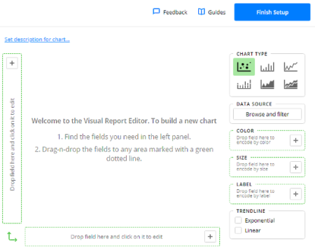
All the other charts types automatically choose a few initial data fields for the charts, whereas, in the blank chart, you can manually add data fields to the axes of the charts. In all the charts type, you can fully customize the chart and make desired modifications. You can represent any dataset on any axis and add multiple datasets on each axis.

In the case of each chart option, you can visualize the Trello board datasets in the following types of charts:
- Scatter Plot
- Bar Chart
- Line Chart
- Stacked-Bar Chart
- Area Chart
- Stacked-Area Chart
This website gives you several options to personalize the chart appearance. On the right side of the chart, it shows you a Color, Size, and Label options. You can drag-drop datasets to these options to encode them by respective option. You also get an option to make the chart trendline exponential and/or linear.
After all the customizations and personalizations, you can finish the setup to get the final chart. From there, you can export it to JSON, CSV, or PNG format. You can also print it to PDF, and share an interactive version of the chart by generating a public share link to the chart and get an embed code. This website also gives you an option to stop the link sharing anytime you want.

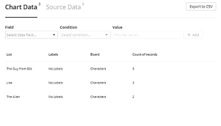
Even after finishing the setup process, you can still edit the chart anytime you want. You can browse the Chart Data and Source Data (Trello Board data) with filters and export both, Chart and Source Data, to CSV.
Apart from Trello, you can use this website to create charts from
- Link (direct download link to CSV or JSON data)
- GitHub (visual insights related to your GitHub repositories)
- PostgreSQL (PostgreSQL tables into charts)
- MongoDB (MongoDB data collections into charts)
- File (CSV or JSON file up to 50 MB)
Create charts from Trello board data here.
Closing Words:
Vizydrop is an intelligence solution to visualize Trello board data in forms of interactive charts which you can share with others. It lets you customize the chart the way you want and also gives you embed code to add the chart on webpages.