Update 2022: This website no longer exists.
The new and redesigned version of MySpace called the New MySpace has been opened to the public. This is nice because the New MySpace has been on private testing from July and was only accessible via invites.
The New MySpace has been released and timed with the release of the Justin Timberlake’s new single called “Suit & Tie” (Anyway was the single released to promote the website or the website released to the public to promote the single; I am confused). Because the login page of the New MySpace features a promo the new single by Timberlake as seen below. 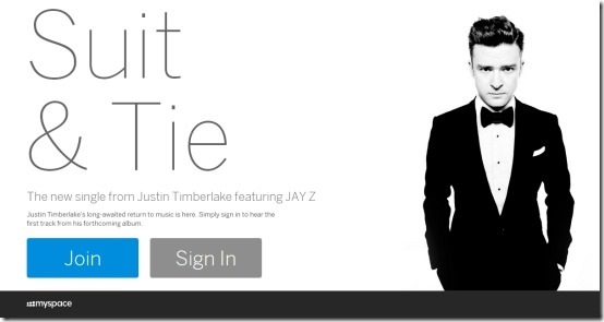
Also entering the MySpace.com in your browser will redirect you to the New MySpace. And the old one is being referred to as MySpace Classic. The sites redesign is impressive and makes the website look hip and focused on music. But the true potential of the site cannot be experienced until there as quite a bit of users of this website. Which for now are not that much.
Features of the New MySpace:
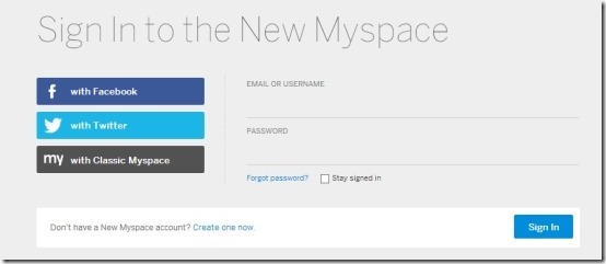
- Now let us start with the basics: you can join in this site my simply clicking on the join button as seen in the screenshot above. After you have clicked on the join button you will be have a page as shown below in the screenshot, which offers you the ability to login in to the new site using your Facebook, Twitter or the Classic MySpace account. Also, the New MySpace offers you the ability to create a MySpace account if you wish to do so. I tried it out using my Facebook account.
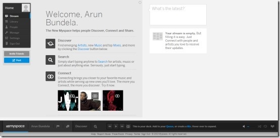
- After, you have successfully logged in, you will be able to see your home page which will be quite similar as shown in the screenshot below. As you can notice the interface of the New MySpace is extremely clean and simple. As seen below, your stream remains in between and your posts are located on the right. You can navigate through the site using the navigation and function buttons which are located on the extreme left of the screen. Also as MySpace is all about the music now; so you have the music player always with you, anywhere you navigate to in the website as seen in the screenshot below.
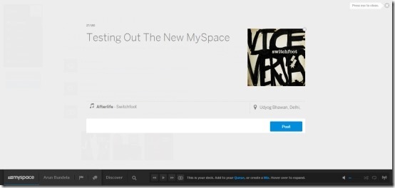
- When you update your status, you will have the interface as shown in the screenshot below. Which again by the way looks sleek. From here you can write what you want; and also add songs to your status which the other users can stream with ease. One thing that I did not understand is that the status updates can only be of 150 words; I know that Twitter is a big thing, but MySpace ain’t Twitter. I feel that after listing to songs or the radio; most probably the users might have things to say which are more than 150 words. Also you can update you status from the small input box as seen in the right most part of the screen in screenshot above (and below).
- The New MySpace also introduces the discovery function; clicking on this brings up the news, updates, and stories related to music. All this information is laid out as square tiles which are horizontally scrollable and so are the rest of the pages that you will encounter, everything here scrolls horizontally.
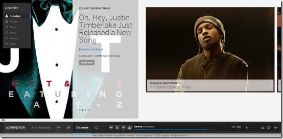
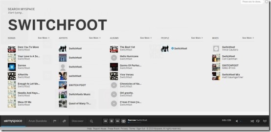
- You can search for the music, artist, album etc. of your choice by clicking on the search button which is located on the music bar which is persistent across all the pages in the bottom part of the page as discussed earlier in the post. This action will bring up a page where all you are supposed to do is type the song, artist etc. and this will bring up the results as shown in the screenshot below. Here all the results as laid out in a simple and structure manner. From here you can jump to whatever you want by clicking on it.
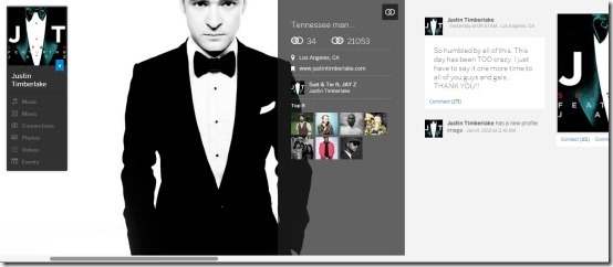
- Also all the artists on the MySpace have a profile; similar to yours. There you get information about them so you can stay updated about them. On this page you will be able to see updates that they have posted, their music, photos, videos, and events. In this manner you can be updated about you artists and know more about your stars.
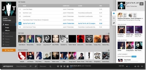
- Now lets move to the most important part of this website: Myspace music player (as the whole network is based on the concept of music, music lover will have lots of fun with this site). The music player keeps things simple and easy to use while providing you with important information in a simple and easy to understand manner. This enables you to discover new music and also people who have the same taste as you. While you have the music player running, you will be presented with information about similar artist which you might like to listen to. Clicking on that tile will take you to the artists’ page from where you can enjoy their creations for free. One thing that I particularly liked about the music player is that it shows information about the artist that inspired the artist that you are currently listenng to, in this manner you can enjoy those oldies as well. The last thing would be that this website also provides you with the ability to listen to various online radio station based artist, song, genre etc.
The conclusion is simple the web site should focus more on the users; so that they can they interact and share amongst themselves. Everything else is good enough for now with its sleek and simple interface.