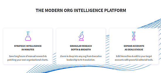
This article talks about a free website to create an organization chart of any company in 1-click. Chartloop is a platform where you can visualize the organizational structure of any company. All you have to do is enter the website of that company and within seconds, you get a granular organization chart of that company.
While creating a chart, you can Select which functional area you want the organization chart for. You can sort the chart by departments, geography, and teams and use the advance editing tool to modify the chart accordingly and shuffle hierarchies. This way, you can have an organization benchmark a particular company with detailed FTEs breakdowns by role and function. Along with that, you can also export the chart to CSV or PNG images to take your research with you.
You can create up to 10 organization charts for free with extra granularity. Export to CSV and/or PNG is also free for those 10 charts. After reaching the free limit, you have to go with a subscription plan in order to create more charts.

Also read: Create Product Roadmap Presentations Online for Free
Create Organization Chart of Any Company in 1-Click
To create an organization chart of any company in 1-click, first, you have to sign up for a free account on Chartloop. After that, you can log into your account and create organization charts. The dashboard has Figma as a sample company by default. You can use this to check out all the features of the platforms and evaluate how you can use this.

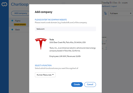
When you are ready to create a chart, click the “Add company” button and type the website of the company of which you want an organization. It takes a second to fetch the information then asks you to pick a function for the chart. This is basically the different department under that company. You can pick any department in the begging as you can add more of them later and it’s all counted as one chart.

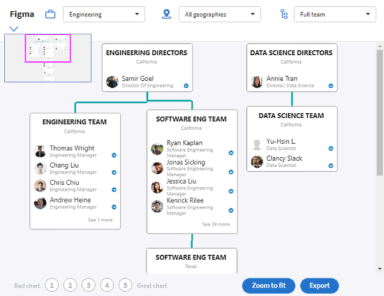
It does take a few minutes to prepare the chart. Once done, it plots the organization chart of the selected department of that company. The chart shows the complete hierarchy of that department including all the teams. At the top of the chart, you can three drop-down options for the department, geographical areas, and teams. With these options, you can get an immersive look into the organization. You can shuffle the hierarchies by dragging a team from its position anywhere on the chart. This way, you can visualize the chart on your terms edit the chart the way you want.

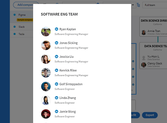
In the case of bigger teams, it wraps that in a box with an option to expand and see the whole team. Along with the name and designation of each team member, it also includes links to their social profiles (LinkedIn). Once you are done with the chart, you can export it to save your research. You get an export button at the bottom right corner of the screen. This export button gives you two options; you can either export the chart as a CSV file with all the details or you can save the visualization in the form of a PNG image. You can also export to both one by one and have the visualization as well as data, both.
Closing Words
Chartloop is a handy platform to quickly create an in-depth and accurate organization chart of any company. It’s useful for marketing researchers and competitors to have an insight into a company and offer detailed organizational intelligence to map sales targets, recruiting pipelines, business strategy, etc.