Here is a free Excel add-in to create radial bar chart for table data. That means if a data is created using Table feature of Excel, then this add-in can help you generate a beautiful radial chart using that data. The name of this add-in is ‘Radial Bar Chart‘ and it works with Excel 2013 or later.
This add-in can generate bar chart for all the columns available in your table data. However, at a time, it can generate the graph for two selected columns only. It also provides three different color themes for the graph. All these features are really good, but you can’t save the generated chart, which I didn’t like. At least, there should be an option available to save the graph as an image.

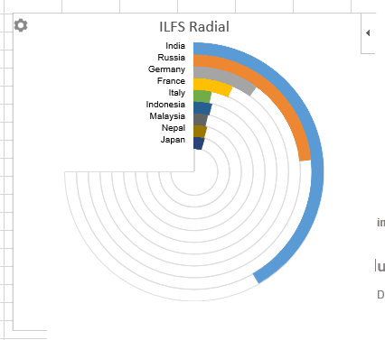
Above you can see the radial bar chart created by me for a table data using this Excel add-in.
Here are some other Excel related tutorials for you:
- How to Create Lists, Navigate, Highlight Rows.
- How To Round Numbers In Excel Worksheets Easily.
- How To Filter Multiple Items From Columns In Excel.
How To Create Radial Bar Chart from Table Data Using This Excel Add-In?
Step 1: Use this link to install this Excel add-in. You must be signed in to your Office account to install the add-in.
Step 2: After installation, open Excel 2013 or the higher version installed on your PC.
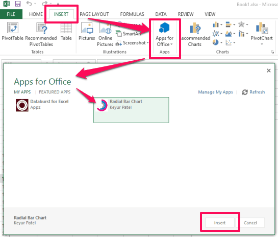
Step 3: Now create a data table or load an Excel file that contains your table data. After that, go to INSERT tab and click on Apps for Office option. This will help you select the add-in and insert. You must have signed in with the same account to access and insert the add-in.

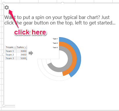
Step 4: The pop-up of the add-in will be in front of you. On that pop-up, there will be a Settings icon. Click that icon.

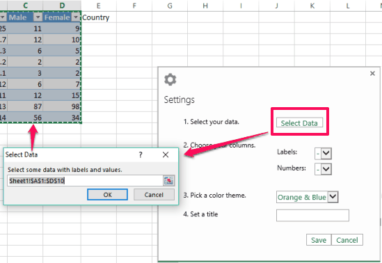
Step 5: Now you need to set a couple of options. First of all, you have to select data (rows and columns). When the data is selected, it will let you select Label and Number (for which the graph will be generated) using the drop down icons.

Step 6: Select a particular theme (Orange & Blue, Night Vision, and Touch of Pink), give a name to the output graph, and press Save button. A beautiful radial bar chart will be in front of you.
You can again access Settings to change the options and generate the graph.
The Verdict:
The add-in is fantastic and very easy to use to generate radial bar chart for table data. Three different themes are also available. Everything is really good, except the missing feature (save the graph as an image).