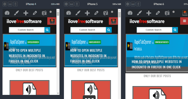
Sizzy is a free website to test responsive websites. It lets you see how a responsive website looks in different devices. The best part of this website is that it shows your responsive website on multiple mobile devices in one go. You just need to enter URL of your website that you want to test, and it will show how it will look on multiple devices together. This is a big advantage over other responsive testing websites or extensions, as they ask you to select a mobile device first, and then render your website in that. Sizzy, on the other hand, shows your website in multiple mobile devices in one go.
Another useful feature of Sizzy is that you can also use it to test local websites for responsive behavior. This is a huge advantage as most of the online tools are able to test only those websites that have been hosted online, but Sizzy lets you test your under development local websites that are just running off localhost.
How to Test Responsive Websites on Multiple Devices Together:
To test your online or local website on Sizzy, just go to its homepage. There, enter the URL of the website that you want to test. If you want to test local website, enter URL as http://localhost:8080/ (or whatever your port is). Do note that you need to give a URL that starts with HTTP or HTTPS; you can’t just give path of a local HTML file to test that.
After giving URL, hit the arrow key. This will open the interface of this website on which it will show multiple devices and will render your responsive website in them. You can immediately see how your website looks on different devices and compare that. In case your website is working fine on one, but not on other, you can immediately identify that.
In the screenshot above, you can see that Sizzy has rendered the website on 3 different mobile devices. As you scroll down, you will see the website rendered on other mobile devices as well.
At the time of writing, following are the devices supported by Sizzy for Responsive Testing:
- iPhone 4
- iPhone 5
- iPhone 6
- iPhone 7 Plus
- iPad Air
- Nexus 6P
- Galaxy S4
- Nexus 7
You can see that the devices included are a good combination of iOS and Android devices. Also, both mobile, as well as tablets, are included in this list. So, you basically get to test your website on most of the popular devices.
Currently, there is no option on Sizzy for you to add more devices for testing. But as per the developer, this option would be added to it down the line.
Other features of Sizzy for responsive website testing:
Sizzy has a very nice interface for responsive testing, and here are some of the features included in it to make the responsive testing process even better:
- You can choose to test website on all the devices, or only on Android or iOS devices.
- With each device, it shows the size of the device.
- You can change orientation of any device to test the website in both landscape as well as portrait mode. You can choose to change orientations of all the devices together.
- You can also show keyboard on all the devices.
- You can scroll your website on each device individually. There is no option for synchronized scrolling on all the devices together.
- Sizzy has a Chrome extension as well.
Verdict:
Nowadays, each website has to be responsive, and it becomes necessary to test a website on different resolutions. Most of the tools provide the option to test website that is already hosted online, but Sizzy is one of the few options that let you test responsive behavior of local websites that are still under development. Also, the fact that it shows how website renders on multiple websites in one go makes it extremely fast to test responsive website.

