In one of my previous articles, I mentioned quite a few alternative E-mail service providers for those of you who love to experiment and moreover, want to get rid of the clutches of the established names. But as I have always said, choice is a good thing. And the only thing better than having choices is, well, having more choices. So today, ILFS would be adding another name to the list of great and free alternative E-mail providers, that it has introduced you guys to. Say hello to Yipple Mail.

Yipple Mail: A feature laden free E-mail service.
I’m sure the first thought that might cross anyone’s mind upon hearing about the the word Yipple would be – “Yipple? Seriously? What kind of name is that?”. To be honest, I was a little flummoxed too at first. But then, just because something has a crazy sounding name, doesn’t necessarily mean it’s bad. And believe me, Yipple Mail is a seriously good service, far from bad. At least for a free Email service, it’s quite good. And it features one of the better looking User Interfaces. And it has other features too.
Alright, enough with the talk. Let’s go through a visual tour of Yipple to see what this weirdly named E-mail service provider has got to offer.
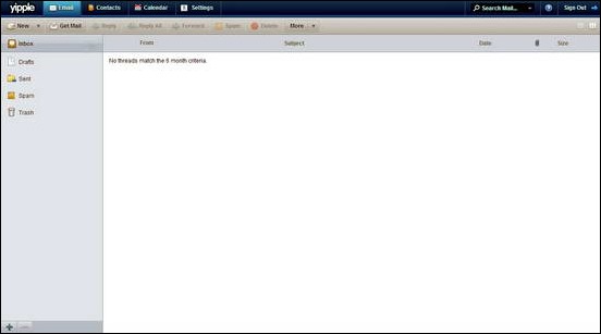
You can sign up for the service directly at the homepage. The homepage is a pretty colorful one, full of butterflies and flowers. Something tells me the girls are going to like it even more. The signup process is the standard deal. Completing it takes you straight to your inbox. And here’s how it looks.
As you can see, the above screenshot illustrates the following features of Yipple Mail:
- Clean and Functional interface, based on the AtMail E-mail client.
- Tabbed interface allows you to view your Emails without navigating away from the current view.
- Your Email is searchable through the search box on the right.
- Multiple user defined folders can be added.
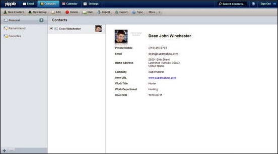
The contacts view is equally impressive, accessed via the Contacts tab. You can add a ton of information to your contacts. Furthermore, contacts can be synced to E-mail clients, and exported too. Here’s how a sample contact looks like.
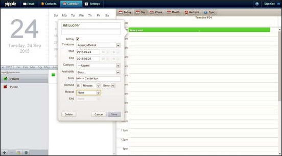
The calendar offered by Yipple Mail has to be one of the most beautifully designed ones. I believe the following screenshot would best illustrate my point.
Some features offered by the Calendar are as follows.
- Ability to add multiple calendars, as per requirement.
- Periodic reminders for upcoming events.
- A bucket load of categories for assigning to events.
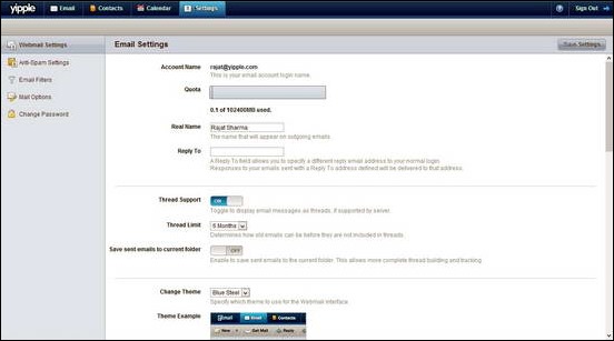
Finally, the settings Tab allows you to tinker almost everything, in order to make Yipple Mail best suited according to your needs. It has a multi view interface, as illustrated below.
The following pointers should give you a basic idea of the options that you can play with, in the Settings UI:
- Webmail Settings: Enable/Disable Rich E-mail notifications, Change Inbox view, Add E-mail signature etc.
- Anti-Spam Settings: Changing SPAM filter sensitivity, Whitelisting and Blacklisting domains etc.
- E-mail Filters: This option allows the user to define custom E-mail filters.
- Mail Options: Enable/Disable E-mail forwarding, Specify auto-responders.
- Change Password: The obvious.
Yipple Mail: Features Summarized
- Clean and Functional Interface.
- Calendar & Contact syncing with almost all major E-mail clients.
- Full POP/IMAP/SMTP support.
- Scheduled reminders for upcoming events.
- Ads in Outgoing E-mail footers.
Conclusion
Yipple Mail is a great free service. It has one of the better looking E-mail interfaces that we’ve seen. Though I personally believe that its feature set is limited as compared to the Competition, but it is still worth a try. Granted, Yipple may not replace anyone’s Gmail/Outlook/Yandex E-mail accounts any time soon, but anyone who’s looking to try something different should give it a try. At the very least, it can serve as your go-to E-mail service for things that are not so important, like random newsletters.
What do you guys think about Yipple Mail? Do you think it’s worth a try? Let me know in the comments below.
