Here is a free and very interesting add-in for MS Excel that helps to automatically generate a beautiful sunburst visualization for your Excel data. The name of this add-in is ‘Databurst for Excel‘. It automatically detects the data as well as its categories and creates a beautiful chart for that data. For example, if you have created a population data, finance data, or any other data, which includes multiple rows and columns, then you can take the help of this add-in to generate a beautiful pie chart or graph.
Using this add-in is also simple. All you need to do is select rows and columns and give a click to generate the piechart. You can also save the graph as SVG, PNG, or BMP image by right-clicking and selecting the ‘Save image as’ option. So, the add-in is really fantastic. However, there are few points to remember:
- This add-in works with Excel 2013 or later versions.
- Only data which is created with Excel table and interactive filters is supported by this add-in.
So, if all these points are met, this add-in is very useful for you.

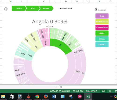
Above you can see the sunburst visualization of a sample data generated by me using this Excel add-in.
We have also covered 5 other free Add-Ins to Enhance MS Excel.
Using This Free Add-In To Create Pie Chart for Excel Data:
Step 1: Go to this link to open the Add-in homepage and install it. You must be signed in to your Office account.
Step 2: Now open Excel 2013 or higher edition on your PC and sign in with the same account that you used to grab the add-in. Also, you should open an Excel sheet that contains data created using Excel Table. Or else, you can manually create the data as per your need.
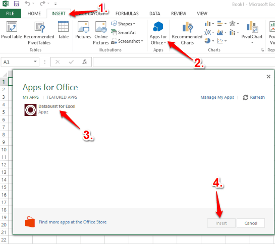
Step 3: Now open Add-in pop-up. For this, you need to click on INSERT tab available in the ribbon menu and then click on Apps for Office option. It will open a pop-up using which you will be able to find and insert Databurst for Excel add-in.

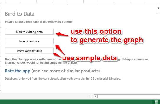
Step 4: The pop-up of this add-in provides Bind to existing data option. You can use this option and then select the table data. After this, clicking on OK button will automatically generate the pie chart or sunburst visualization of data.

Apart from this option, there are two more options that you can use to generate a sample data and create graph of that data.
After generating the graph, you can have a look at it and save it as image.

The Verdict:
For me, it was a good and interesting experience using this Excel add-in. A beautiful sunburst visualization of data looks really good and helps to cross check data in a colorful chart.